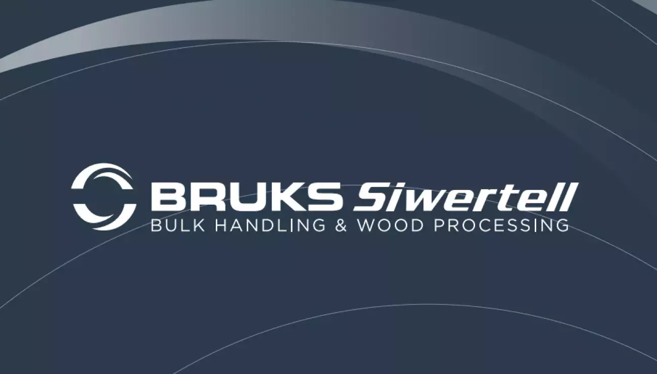
Bruks Siwertell’s united strengths represented in new brand identity
22 Jun 2020
Bruks Siwertell has launched a new brand identity designed to reflect the values, combined strengths and capabilities of its products, solutions and services. It includes a new Group logo, which will represent both the Bruks and Siwertell brands in all future communications.
“We have grown our business significantly over the last few years and this is a natural stage in our transformation process; a new look to show the market that we are bigger than our individual brands,” says Peter Jonsson, CEO, Bruks Siwertell Group. “We have a market-leading portfolio of products and services for the dry bulk handling and wood processing industries. These are distinct business areas in their own right, but they have a lot of natural crossovers that deliver effective synergies. We want to highlight these so that customers can draw upon their benefits.
This joint branding initiative opens the door to a future of continuing our legacy of innovation, entrepreneurship, and quality design
“Our new appearance is part of a recognition process,” adds Mr Jonsson. “It shows customers that Bruks and Siwertell products are part of the same family, and enables the instant association of our equipment with the ability to add value to operations, generate profitability and offer an impressive return on investment for their owners.”
“This joint branding initiative opens the door to a future of continuing our legacy of innovation, entrepreneurship, and quality design,” says Emily Braekhus Cueva, Marketing Director at Bruks Siwertell Group. “Our drive for improvement and the development of new solutions and sustainable incentives is represented in our new identity.
“The Bruks and Siwertell brands are deeply settled and respected within their respective business segments,” she continues. “We have kept their separate identities, but brought them closer together for common communication purposes, so that all customers within Bruks Siwertell recognize them both. Therefore, some elements have been retained and we have also introduced new ones.
“Worldwide, customers will still see the single product Bruks and Siwertell brands on our ship unloaders, ship loaders, conveyors, stacking reclaiming systems, wood chippers, screening and milling systems,” Ms Braekhus Cueva explains. “They will also see a new logomark to show that, although they each represent different types of products, both brands are now part of a bigger family, able to offer a much wider span of equipment. Together, they complement each other and build a stronger portfolio.
“The logomark is designed to evoke a feeling of focus and speed, with the circles signifying movement and velocity,” she adds. “The semicircle can be interpreted as a belt conveyor and the sharp-edged parts potentially as wood-chipping knives, while within the visual of the complete circle you can see one of our core components, the screw conveyor. The three-dimensional angle implies movement and rotation, and the shape of a globe represents our international reach.”
In addition to the logo, the new Bruks Siwertell brand identity comprises other core elements such as signature colors. In communication material, the dark grey will be dominant, and complemented with elements of the blue and red shades from both the original Bruks and Siwertell brands. Subtle background circles, as well as new typography are also significant changes to Bruks Siwertell’s new appearance.
 Bruks-Siwertell